Substance Designer
Portals and Frame Improvements
- Senior Staff Product Designer
- Adobe (Substance 3D)
- 6 months
- What
PortalsTo tidy up complicated graphs
Frame ImprovementsTo organize graphs
- Why
- Texture artists in games and film build materials as node graphs. Past a few dozen nodes, graphs become a tangled mess of links.
- How
- I ran workshops with the team, then made prototypes, UX specs, and stress tests for engineering to build from.
- Result
PortalsShipped in 13.0, June 2023
Frame ImprovementsShipped in 13.1, December 2023
Both still in the product
Problem
Graphs grow fast. A few dozen nodes in, good luck finding your way.
Substance Designer is the node-based tool behind PBR (Physically Based Rendering) materials for games, film, and products. Artists link patterns, filters, and noises into a graph. The graph outputs every texture map, so editing one node updates them all.
A complex watch face crafted in Substance Designer
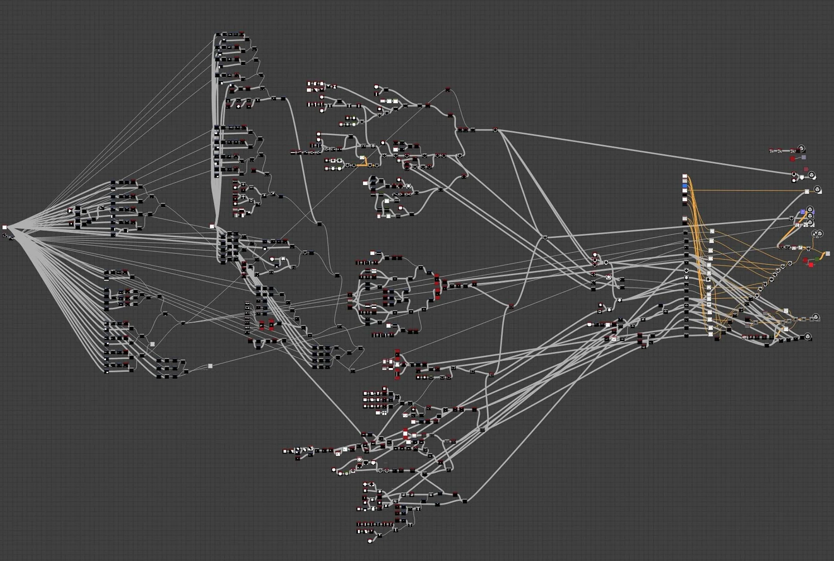
The node graph behind the watch. (80.lv (opens in a new tab))
Challenges
How do you keep a big graph readable without forcing users to continually tidy up?
Spaghetti graphs!
Every connection is a link drawn between nodes. As graphs become larger and more complex, if not managed carefully, the graph can begin to look like a plate of spaghetti.
Hidden structure
Artists build a graph in stages, from base shapes to detail to color, but the graph doesn’t automatically show those stages. Anyone opening it later, including its author, has to work them out again.
Frames came last
Frames were the tool for showing structure, but they didn’t resize with their contents and held one line of plain text, so artists added them once a graph was finished, if at all.
Shipped June 2023 · Version 13.0
Portals
Hide the connections between nodes, like going from networking cables to wifi, while still making it easy to reveal connections.
From Dot Node to Portal Node
Portals use Dot nodes to pass data from a named transmitter node to a receiver node, hiding the connection from the graph by default and clearing clutter from a graph.
Hover or select a Portal node to reveal its connections.
An early prototype of Portal nodes
Design Decisions
Take the line away. Keep the trail.
Built on the Dot node
A portal is a Dot node with a name, not a new kind of node. Artists already drop dots to tidy their links, so portals start from a habit they have.
Connect by name
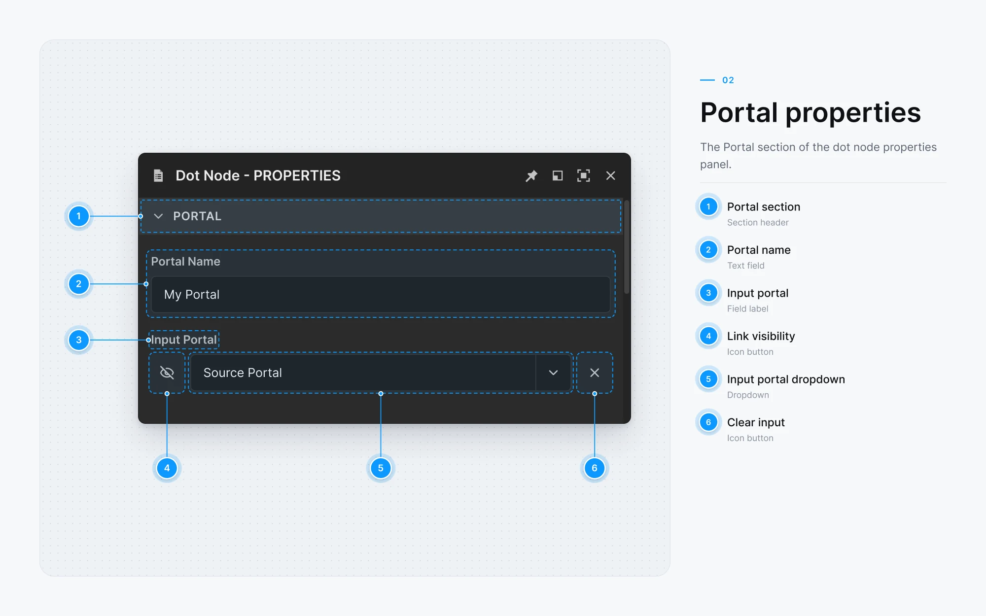
A receiver picks its transmitter by name from a list, so two nodes at opposite ends of a graph connect without a link drawn between them.
Hidden but not lost
With no line to follow, it’s easy to lose track of where a value comes from. So every receiver can show its link on demand, and its properties name the transmitter it reads from.
Portal Prototypes
The prototypes worked through how a portal shows itself in the graph:
- Pins that can be shown or hidden
- A link you can reveal when you need to trace one
- Properties that read the same way from the graph or the panel
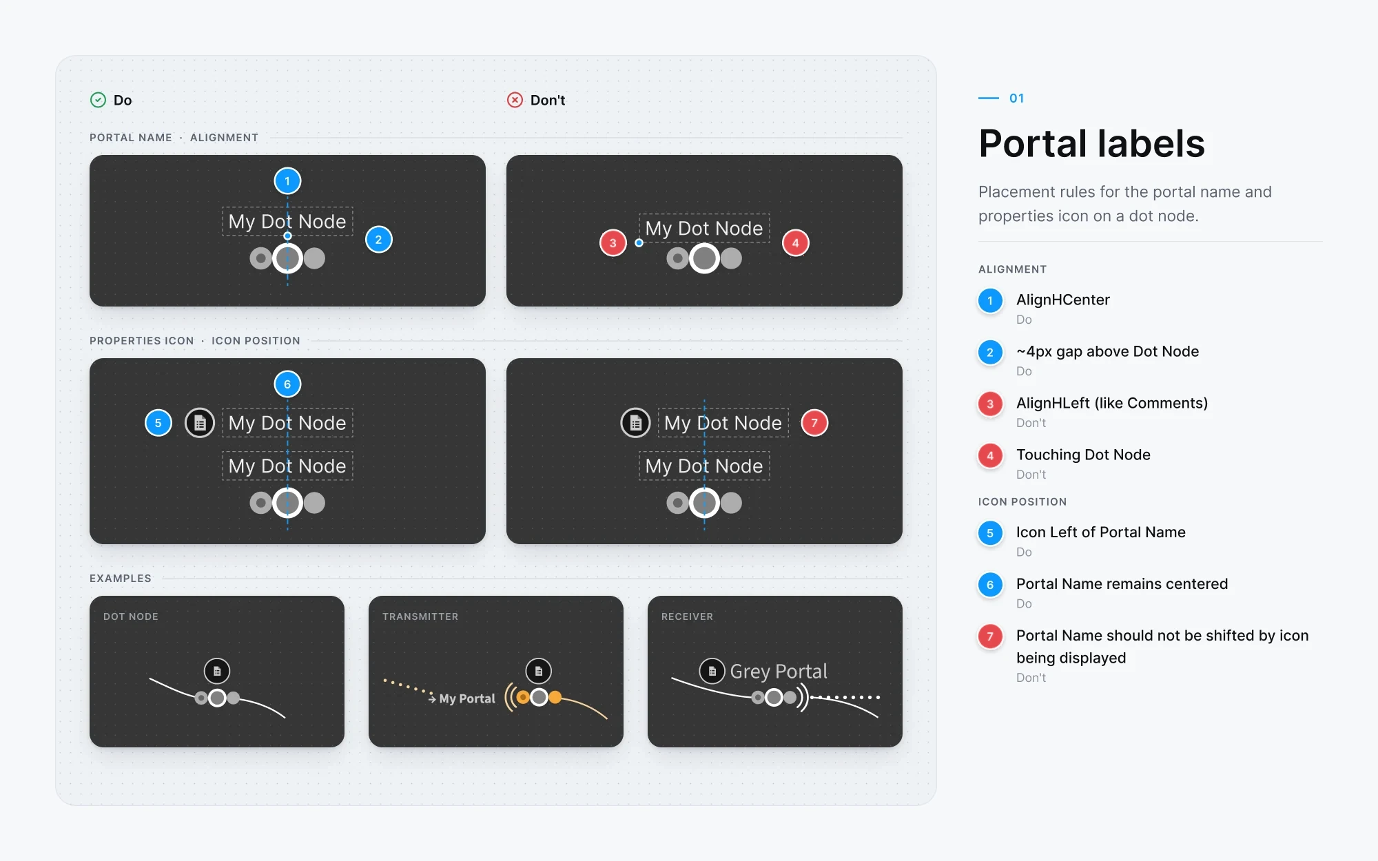
Portal UX Specification
Annotated spec sheets for the portal behaviors: states, naming, and feedback for transmitters and receivers, so engineering could handle the edge cases consistently.
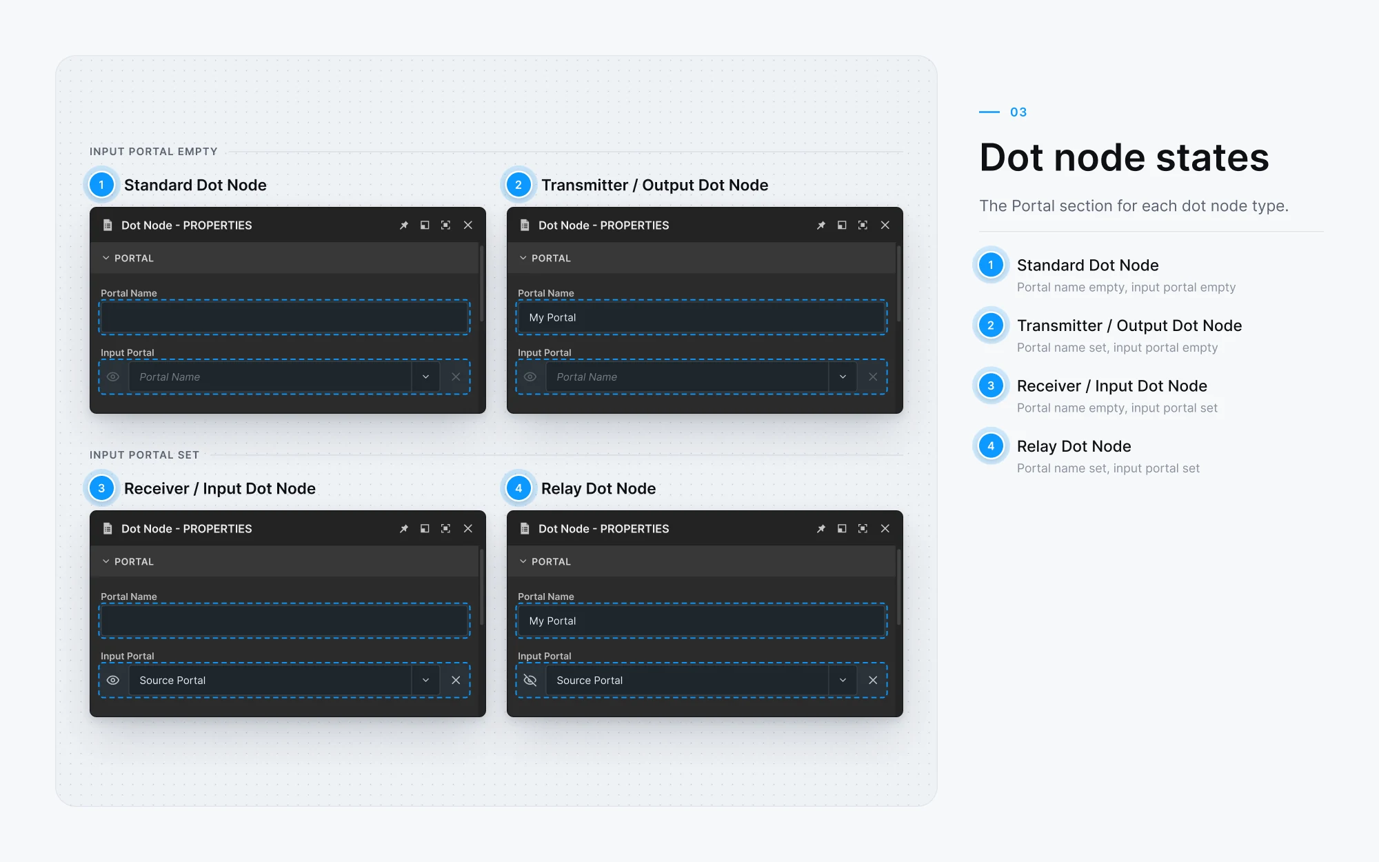
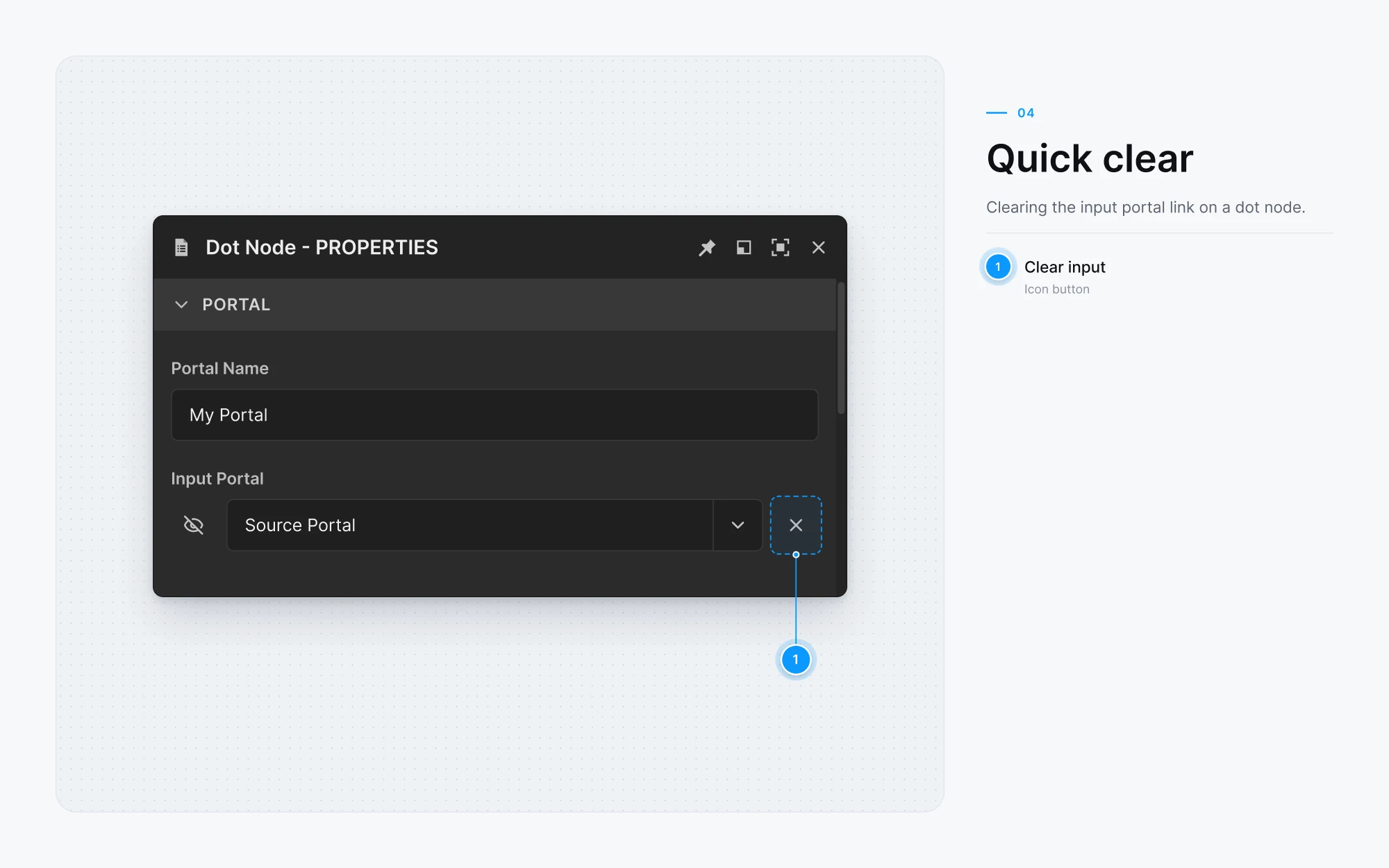
What Shipped
Shipped in 13.0, June 2023, as a new option on the Dot node.
Intro and tutorial
Adobe’s four-minute intro to portals.
Comments from YouTube
This node update will save lives.
This is super handy. I hate lines crossing lines in my graphs. Now I can have a nice clean flow in my graphs. Very nice!
This is one of the most useful features. I know for a fact I’ll be using it every time I open Designer.
This is the best thing to happen to designer since the ability to design a texture for sliced bread.
This is a feature I have wanted in every node graph editor I have ever used, thanks so much for this.
Very handy, especially for noise and grunge maps, I can put them all in a side and call them in a clean way, thanks
Shipped December 2023 · Version 13.1
Frame Improvements
Updating Frames to keep up with graphs as they grow.
Building on What’s There
Frames already drew a box around part of a graph, so I started there. In 13.1 frames grow as new nodes are dragged into them, shrink to what they contain, and now support formatted descriptions.
Interaction Specification
The spec mapped where a click selects, moves, or resizes a frame, and gave the redesign wider edges to grab.
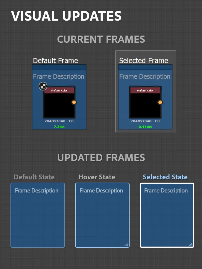 Visual updates
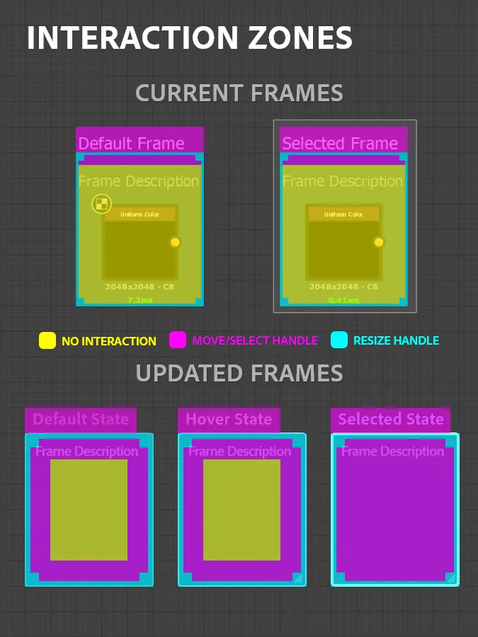 Interaction zones.
Research
Frame Improvements Workshop
What
- Series
- Short Miro workshops I ran for the team
- Focus
- Frame improvements, from brainstorm to design review
- Output
- The priorities for 13.1
Who
- People
- Up to 21 a session
- Roles
- Program management, engineering, design, product, and QA
- From
- The Substance Designer team,
plus partners from the larger org
How
- Length
- 45 minutes a session, kept tight
- Q&A
- Room for those really engaged
- Adopted
- By others on the team
See the whole board The workshop board on Miro
Key Feedback
“Today frames are more designed to be created when the graph is nearly finished”
Participant“Resizing frames is annoying (small hit boxes)”
Participant“Adding Frames is a lot of manual work”
Participant“Accidental overlapping frames suck”
Participant“Frames are always the same color”
Participant“Remove manual managing, focus on creating”
ParticipantSticky notes from the Frames brainstorm, verbatim.
From Ideas to a Milestone
Our first workshop generated a long list of ideas. I hosted a follow-up workshop to review the design work that came out of the brainstorm. We then prioritized and planned the work for shipping.
High
- Auto-expandv13.1
- Shrink to fitv13.1
- Hotkeysv13.1
- Rich text descriptionsv13.1
Medium
- Visual updatev13.1
- Frame context bar
- Parenting
- Quality-of-life fixesv13.1
Backlog
- List of frames
- Collapse
“Very hard to implement”
The 13.1 priorities from the workshop board. “v13.1” marks what shipped in 13.1 (see Adobe’s release notes).
Design Decisions
Make frames versatile enough to add to a graph early in the process, not at the end.
Grow with the graph
Allow users to drag selected items into a frame and have it auto-expand to include the selected content.
Refined affordances
An updated look can provide some usability and legibility enhancements for frames.
One color, three states
Give users flexibility, while mitigating the chance of getting painted into a corner.
Frame Prototypes
Animated samples showed engineering how each behavior should move: selection, nesting, resizing, and labels.
Frame Design System
Users can now set their own frame colors. I set up a clear style guide and stress tests to make sure the design could handle whatever a user threw at it.
Picking a frame color by hue, saturation, and value.
Stress Test the Colors
Any color means users can paint themselves into a corner, and someone will always pick the worst one to see what happens. So I tested some of the harshest options in every state, to make sure the design system worked.
- Fillas picked
- Border50%70%100%
- Hover border40%100%100%
- Selected title40%100%100%
Play the worst-case picks, or drag a slider to try your own.Rebuilt from the original color test sheets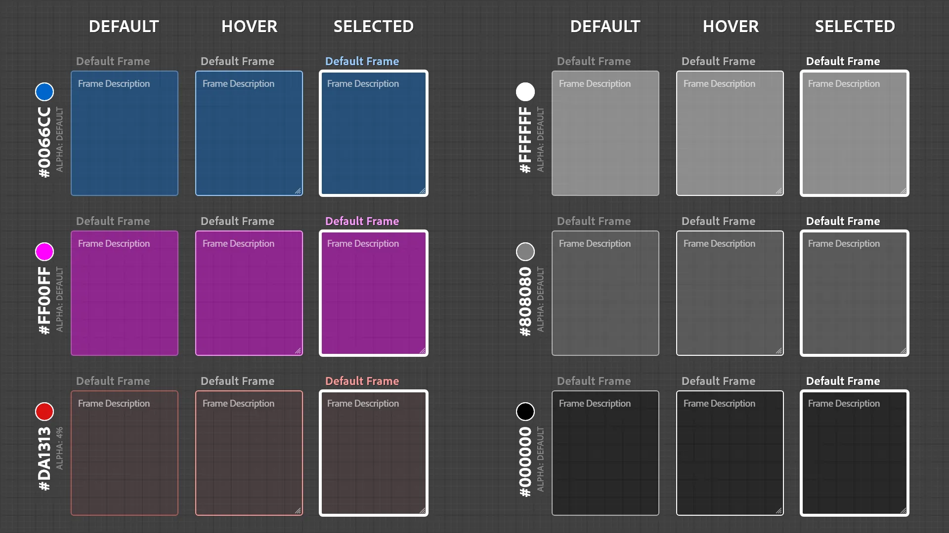 Default alpha
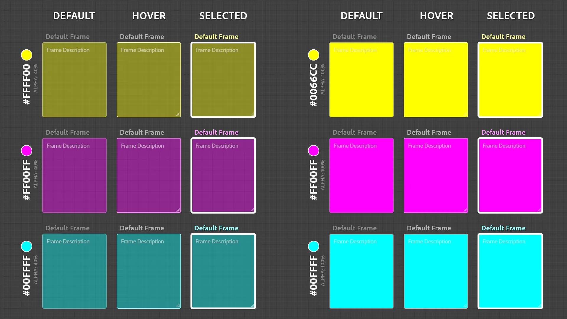 40% and 100% alpha
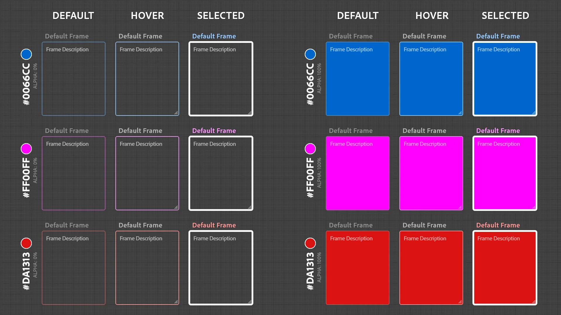 Color at 0% and 100%
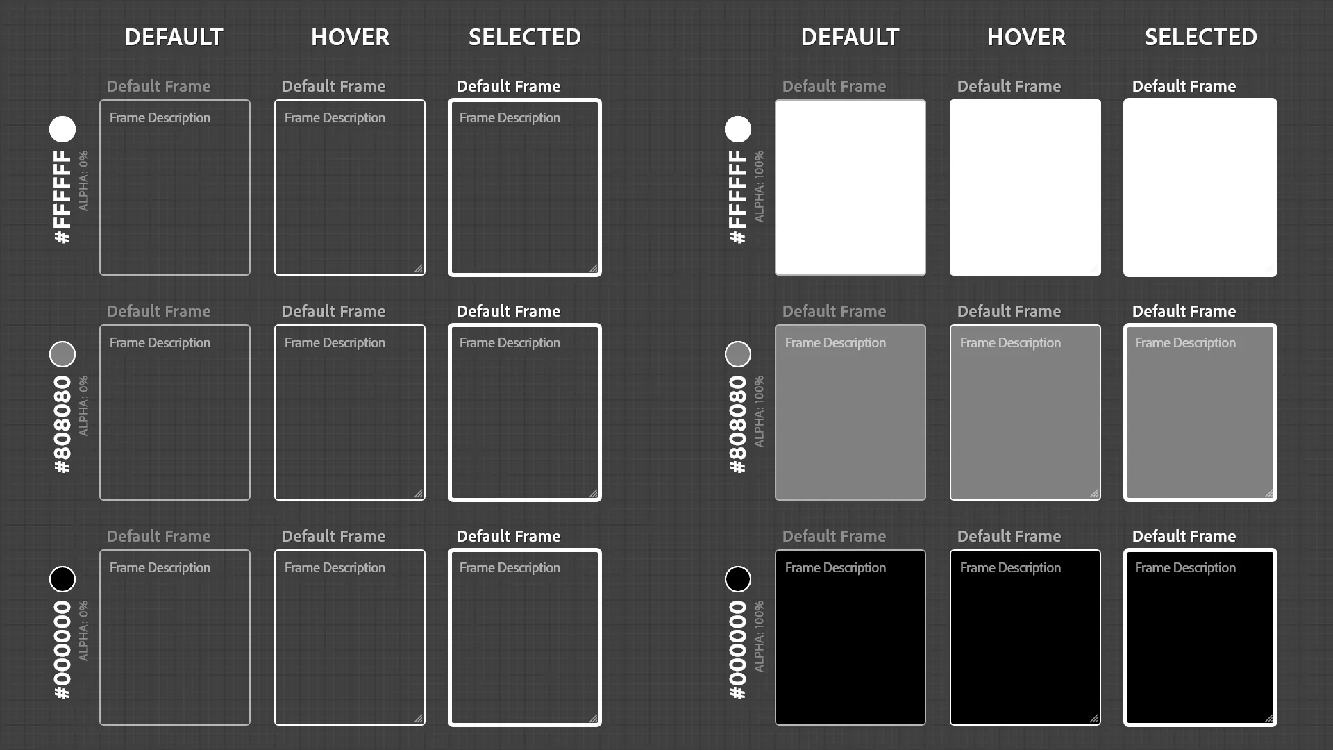 Grays at 0% and 100%.
Frame Description Formats
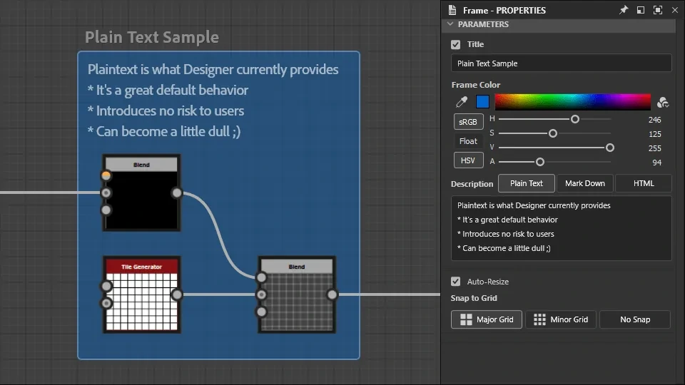
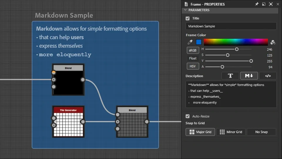
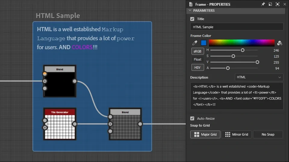
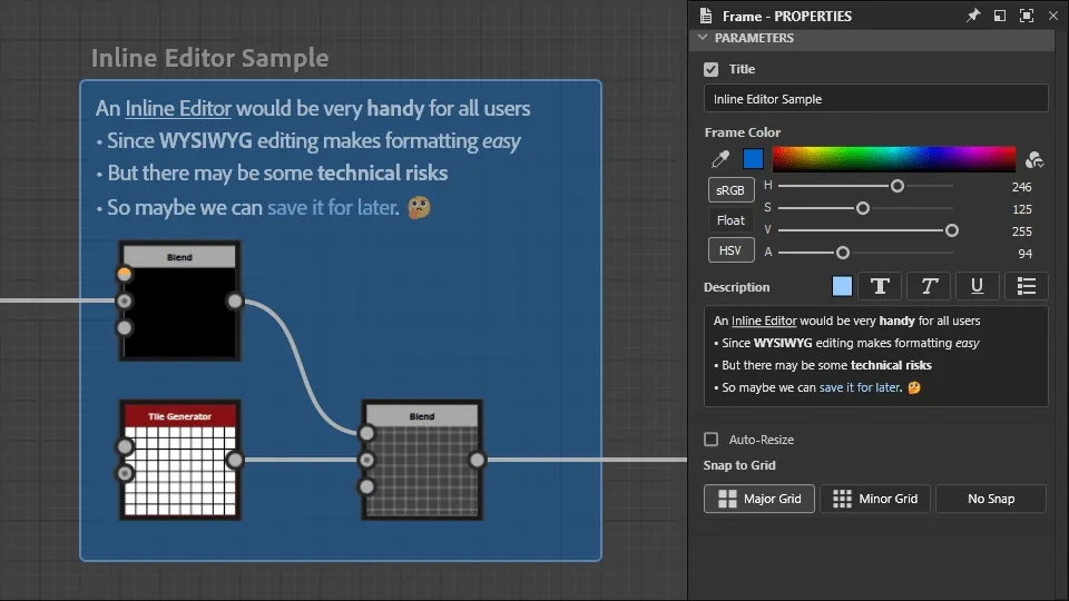
We wanted to provide a way for frames to include rich-text formatting (bold, italic, underline, lists, etc.). Thankfully the Qt UI framework provides multiple options.
What Shipped
Version 13.1 shipped in December 2023 with auto-expand, fit to content, HTML descriptions, new states, and wider resize zones.
Samples from the 13.1 release notes.
Outcomes
Both features shipped in back-to-back releases, and both are still in Substance Designer three years later.
By the Numbers
22,000+
views of Adobe’s portal tutorial, released with 13.0, with 541 likes, as of October 2026
9
new frame features in the 13.1 release notes, from auto-expand and fit to content to new interaction zones and states
All 4
high-priority ideas from the 13.1 priority board shipped: auto-expand, shrink to fit, hotkeys, and rich text descriptions, plus 2 of the 4 medium ones
How It Landed
Artists had been asking for portals before I started, and said so when they arrived.
“Feature got added in latest version.”
A user, closing the Reroute Nodes request on Adobe’s ideas forum
“Has been sorely needed for years.”
A comment on Adobe’s portal tutorial
The Two Releases
Portals
- Portal option on the Dot node: name a transmitter, then pick it as any receiver’s input
- Hidden links: distant nodes connect without a link across the graph
- Quick access to key nodes from anywhere in the graph
“No more spaghetti-style node graphs!”
Adobe, June 2023 release post
Frame Improvements
- Auto-expand: hold Shift while moving a node to grow its frame
- Fit a frame’s size to its content
- HTML-formatted descriptions, for comments too
- New resize zones and more tolerant belonging rules
- A refreshed look
“quality-of-life improvements to the node graph, mainly regarding frames”
Adobe, 13.1 release notes
Substance is used in “the vast majority of AAA games,” per Adobe in 2019.

2023 Scientific and Technical Awards
An Academy Award for the Team
In February 2023, the year I joined, the Academy gave Substance Designer a Technical Achievement Award for its procedural workflow.
The honor belongs to the team who built it over a decade. I was proud to be there the year it came.
Appendix
Yes, and…
A collection of additional activities, or cool experiments that didn’t make the cut.
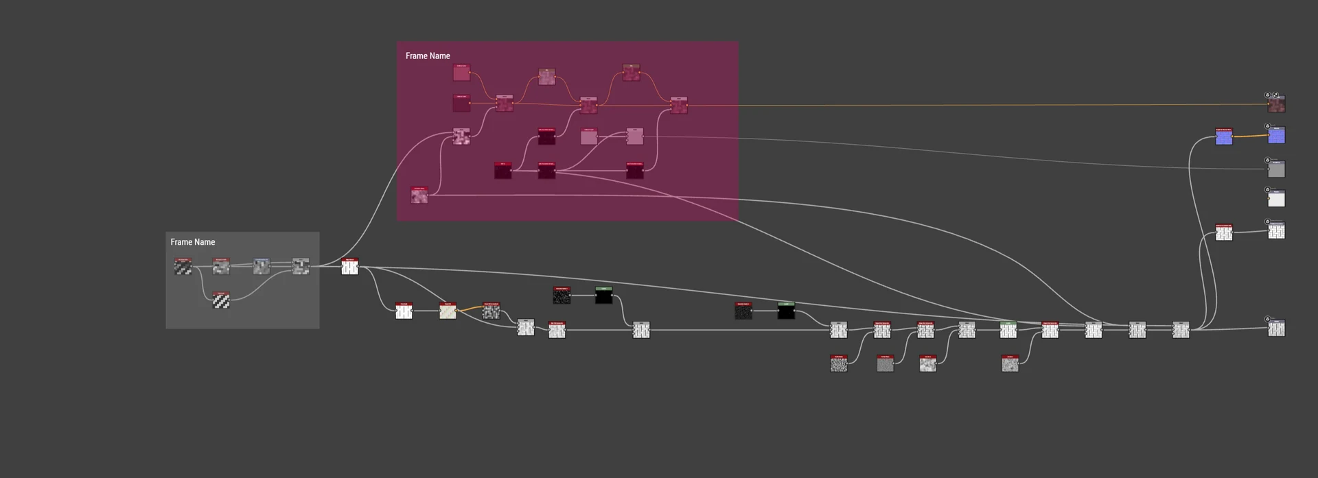
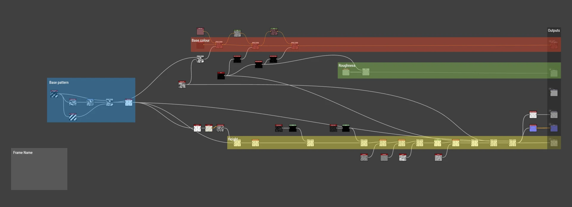
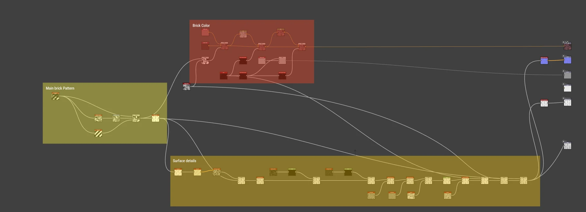
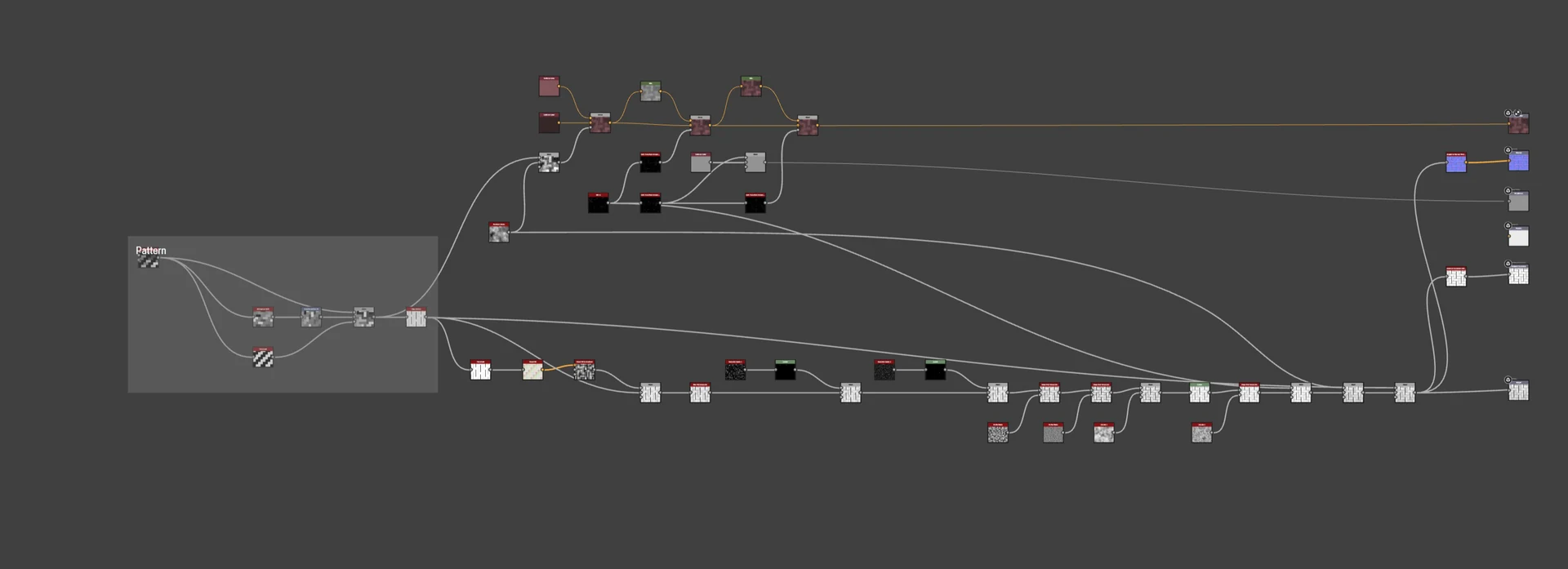
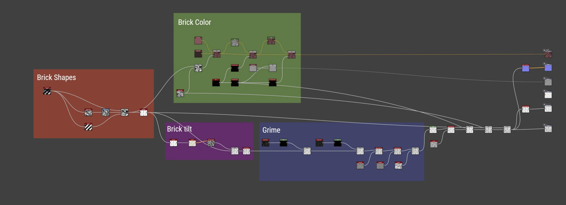
Same Graph, Framed Many Ways
As a warm-up for the Frame Improvements workshop, everyone was given a chance to frame/comment on some sample graphs. No two graphs looked the same, which was a helpful gateway into the discussion that followed.
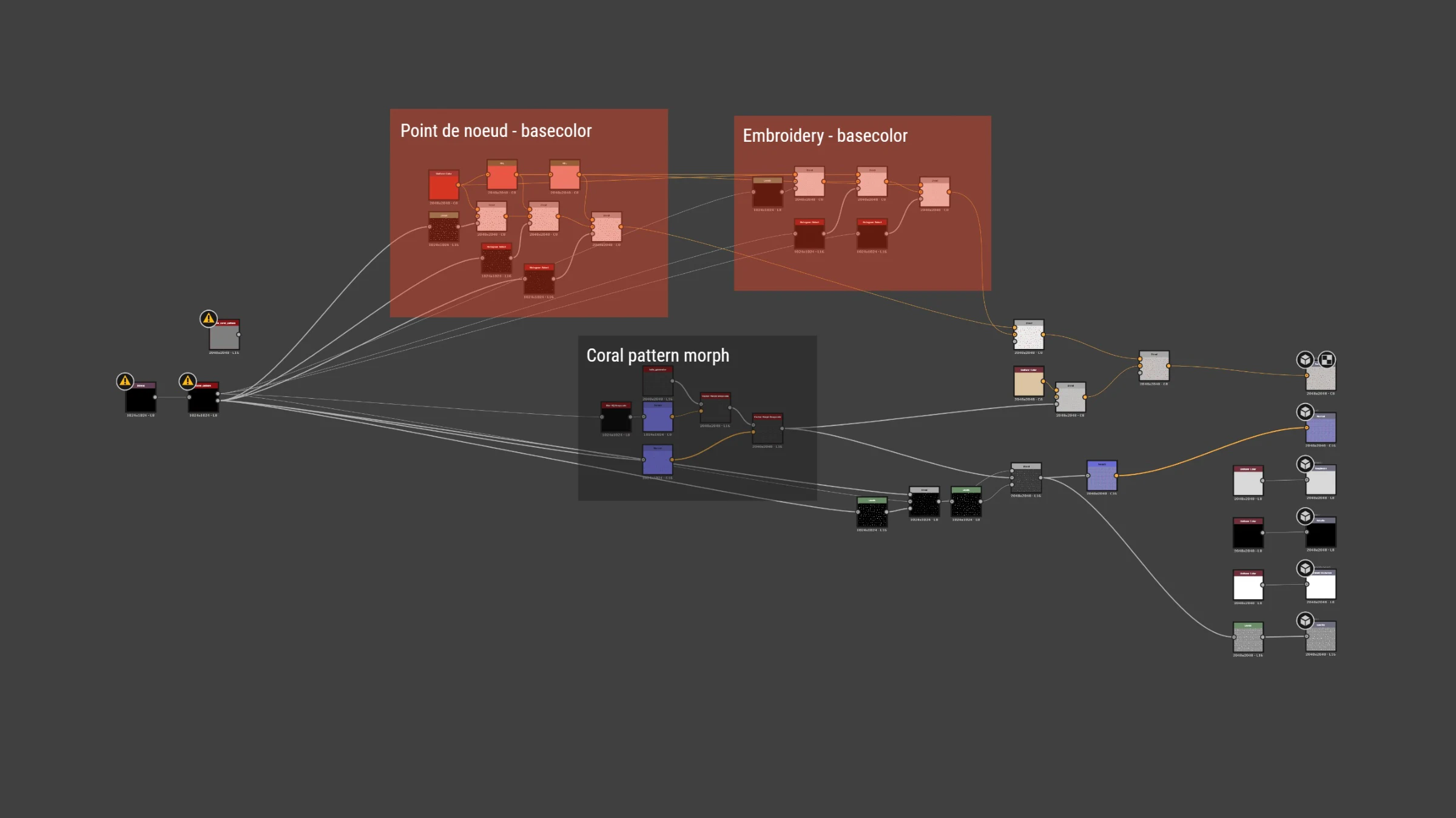
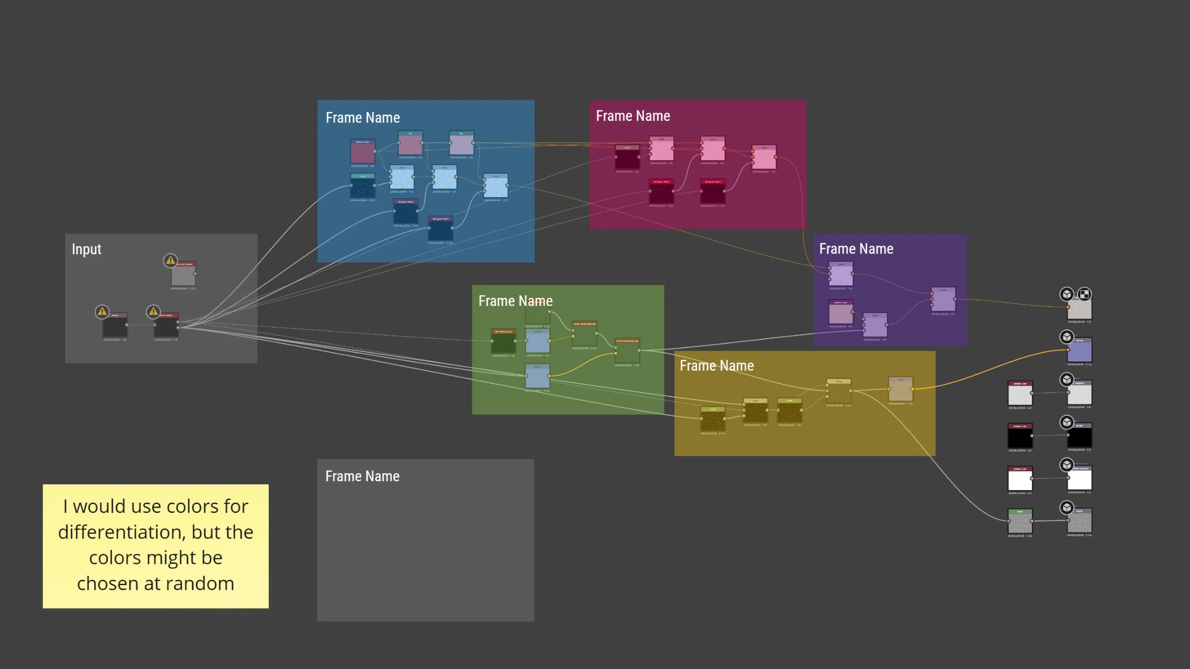
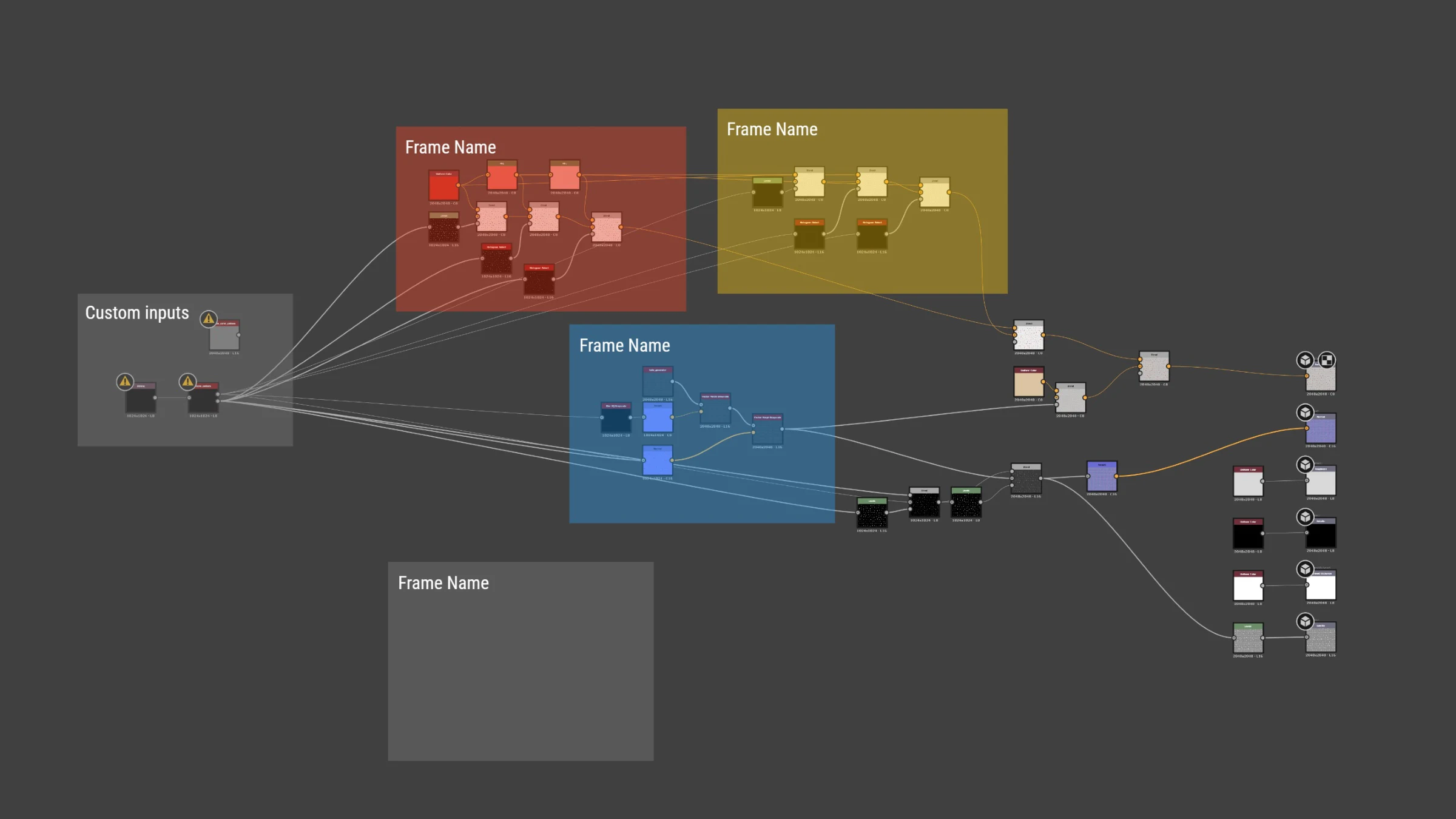
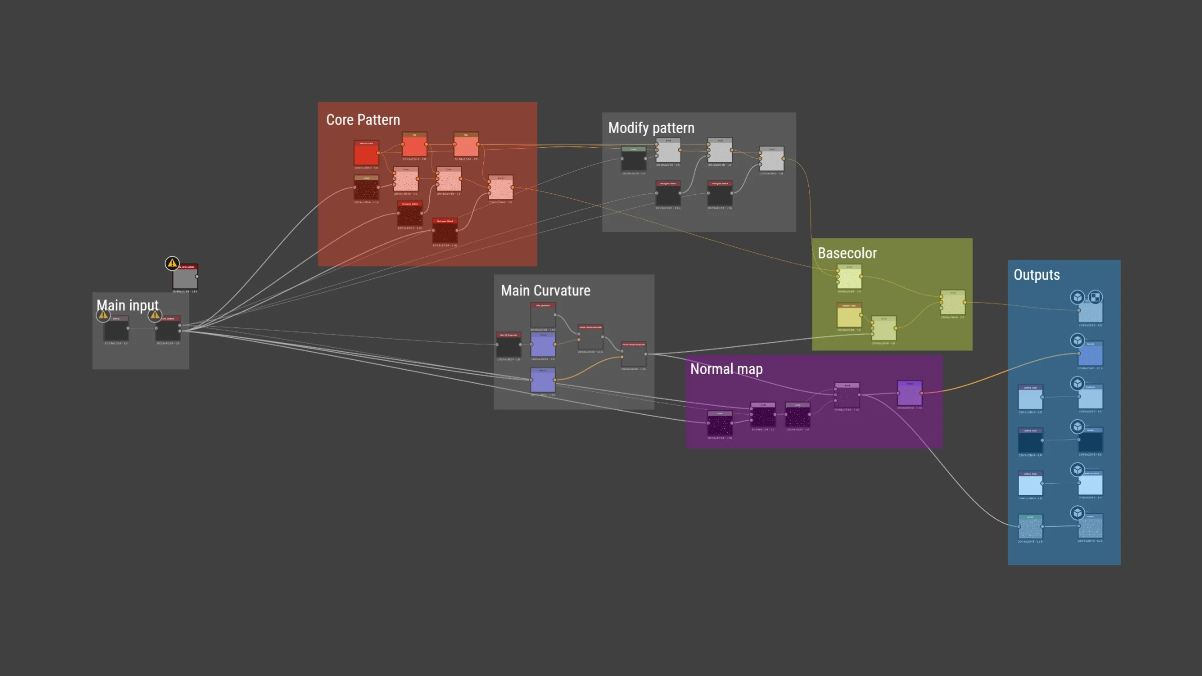
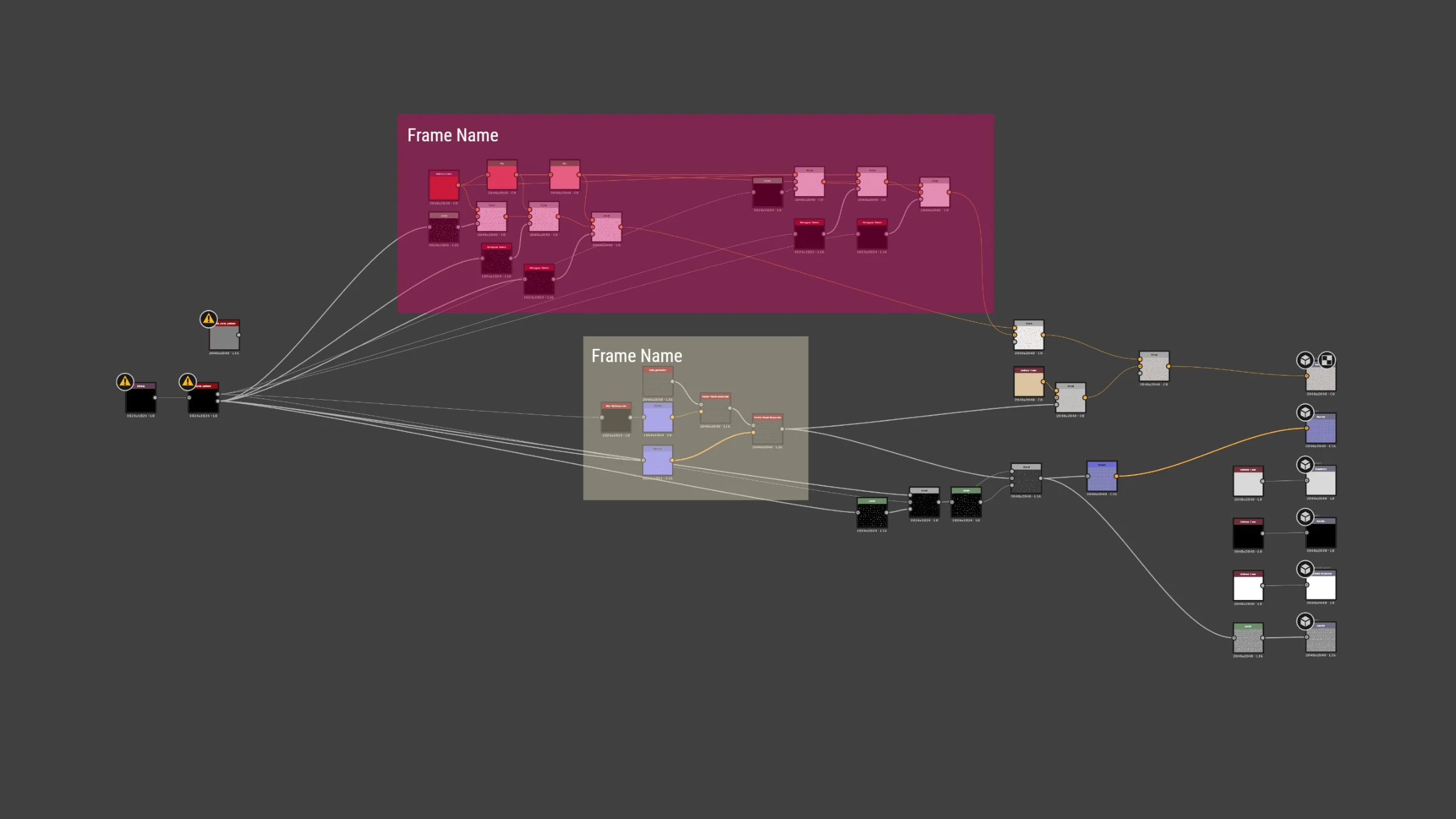
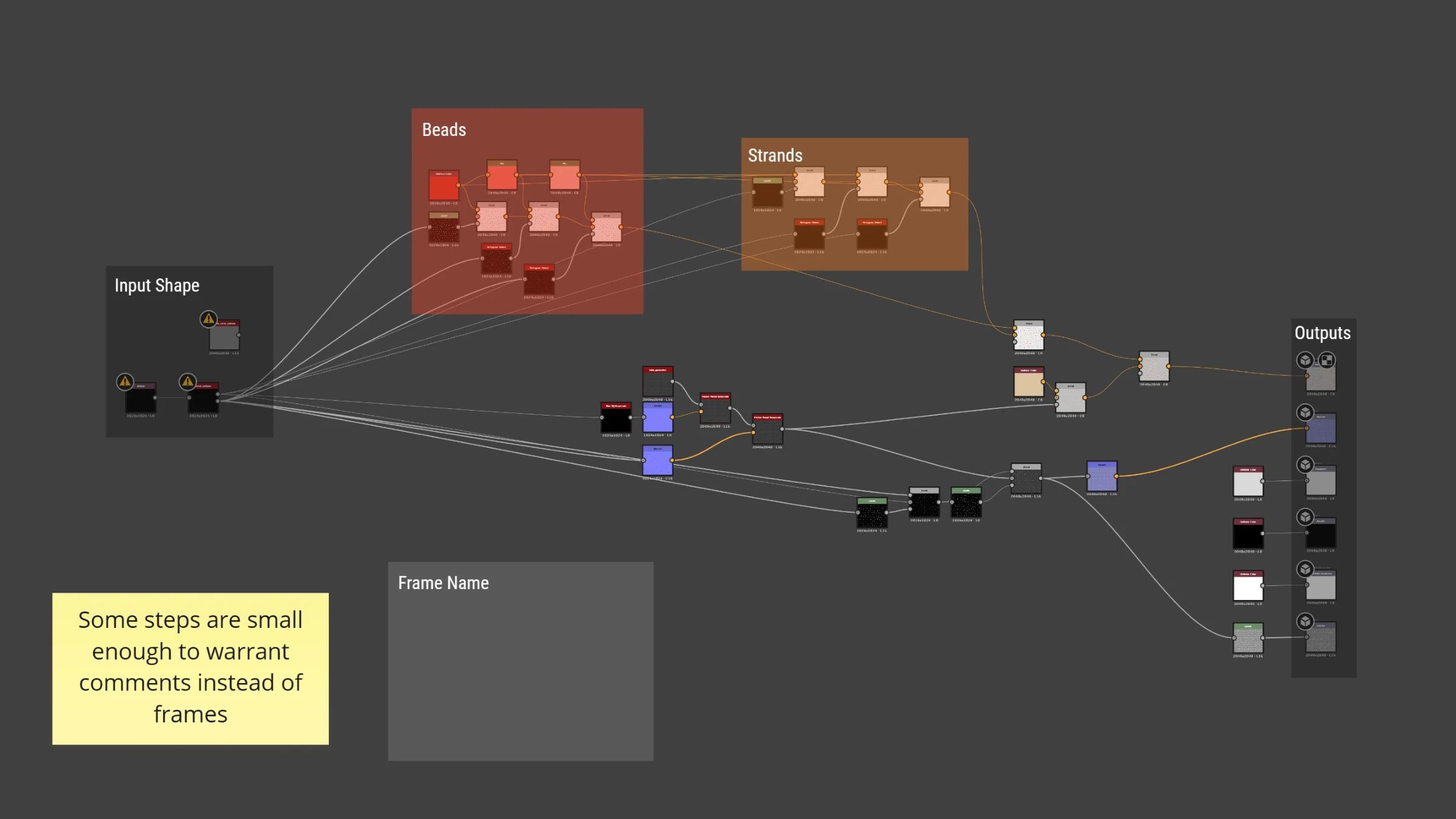
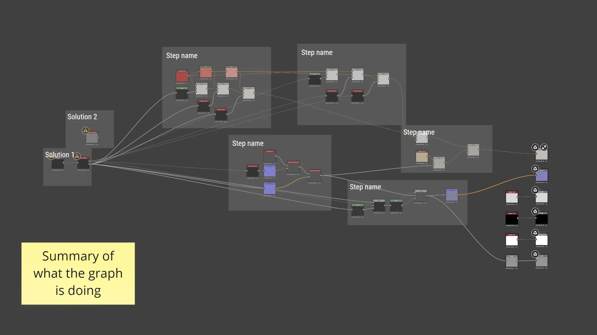
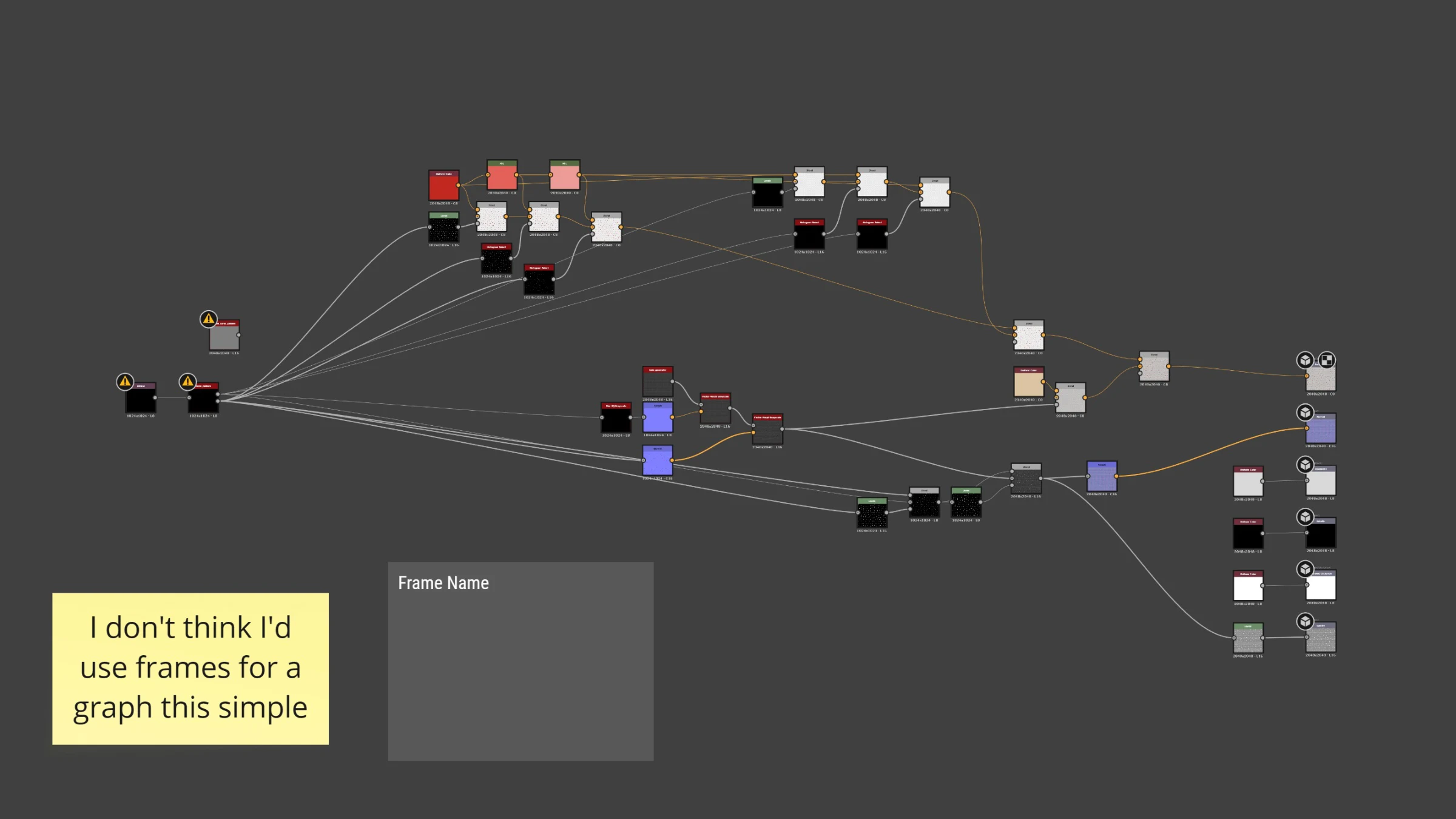
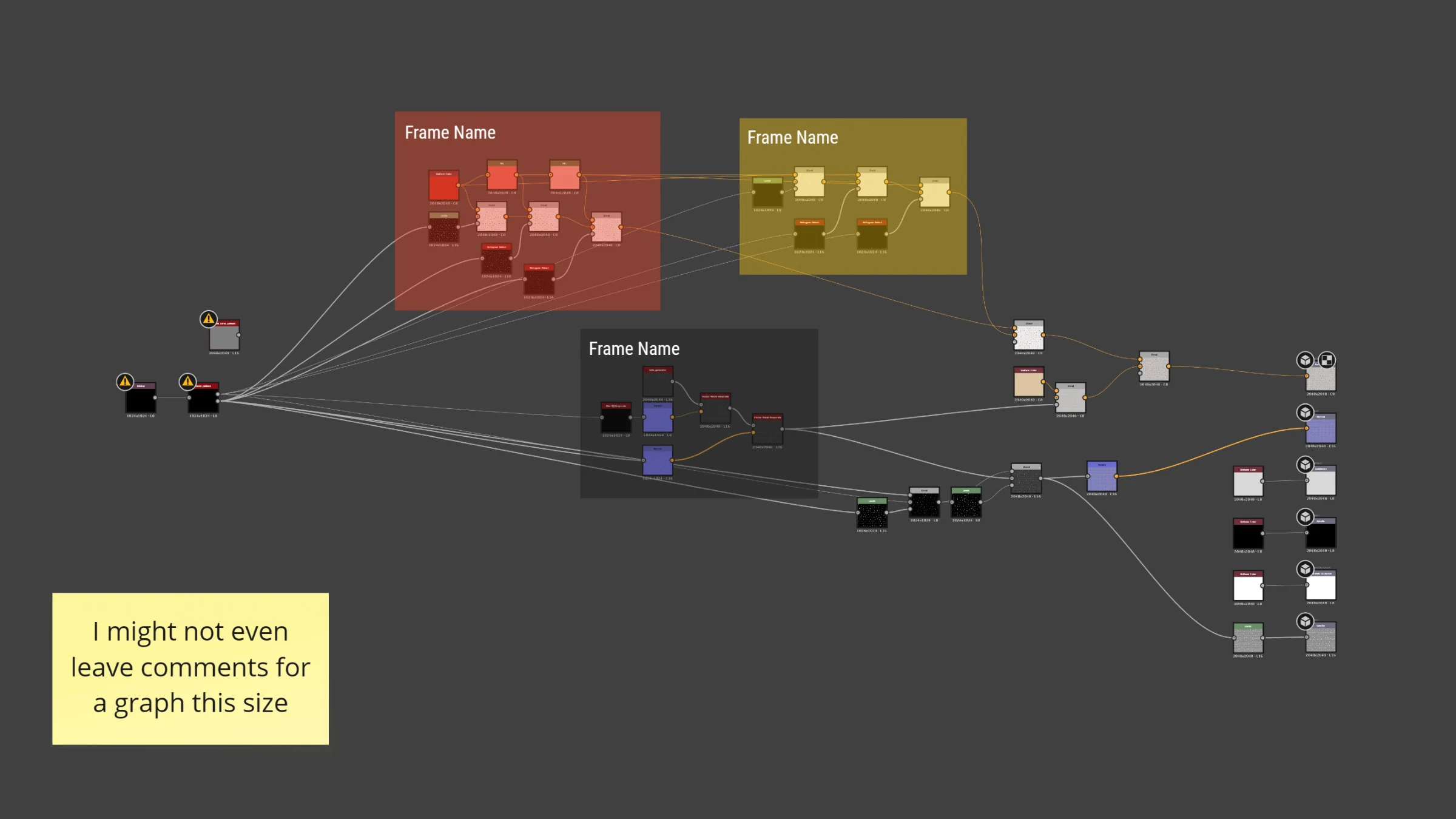
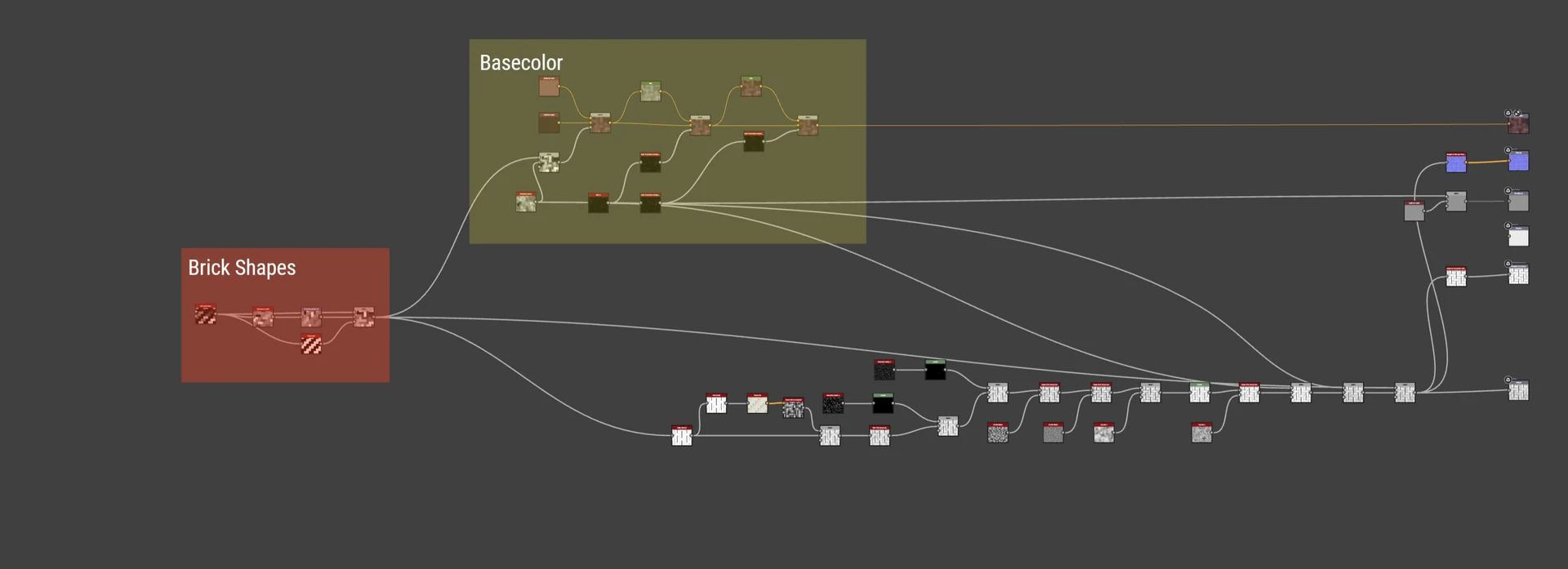
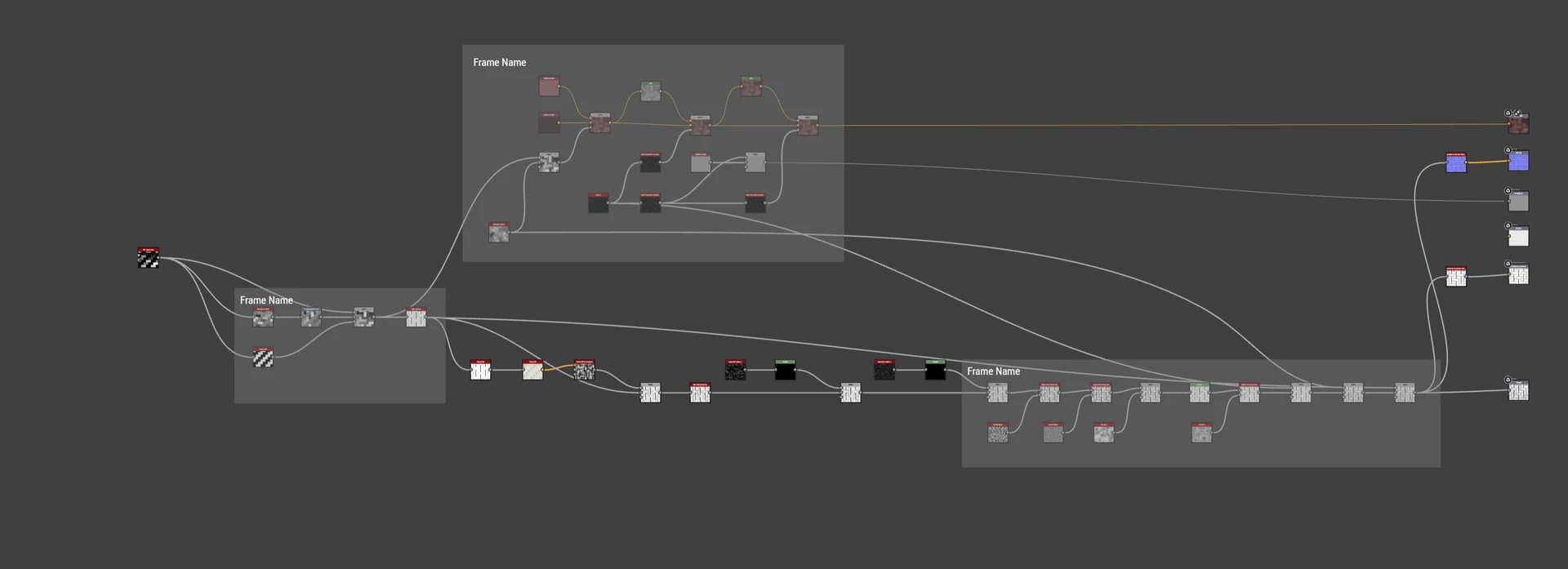
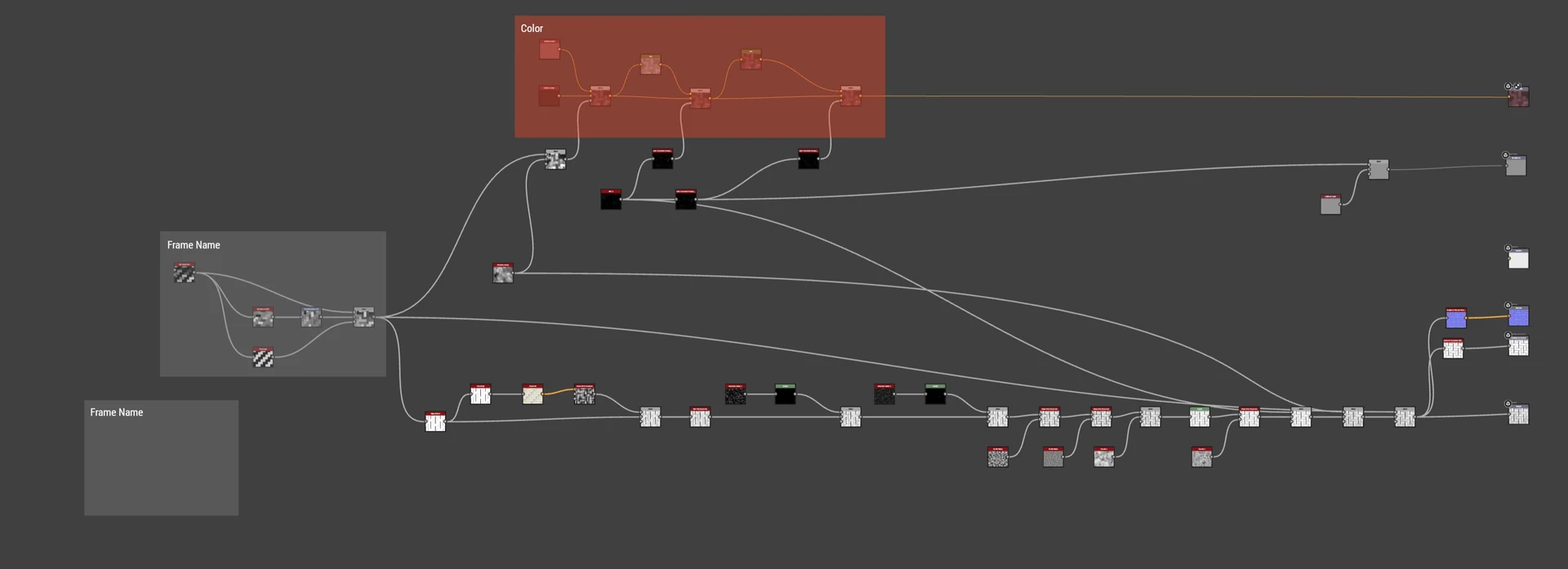
The Warm-Up
For every workshop, I’d give a few minutes for people to filter in and get their tech set up. While that was happening, I’d often have an activity for participants to engage with. Here’s some sticky-note pixel art from one session.
Experiments
Exploration 1
Portals with Previews
Showing previews of nodes in the dropdowns fell out of scope, but would have been handy.
Exploration 2
Testing Node Types in Context
The early design focused on a new Node type that showed a preview of what was transmitted/received, which would read better when zoomed out, but we couldn’t get it to work in scope for the milestone.
Exploration 3
Multi-Input Properties
This design allowed Portal nodes to be treated like a generic portal that values could be passed into and picked up elsewhere.
Exploration 4
Multi-Input Preview
This showed how a user could use the same preview of a node to see what the different data being passed through was.
Cool idea, but too complex for what we were aiming for.
Exploration 5
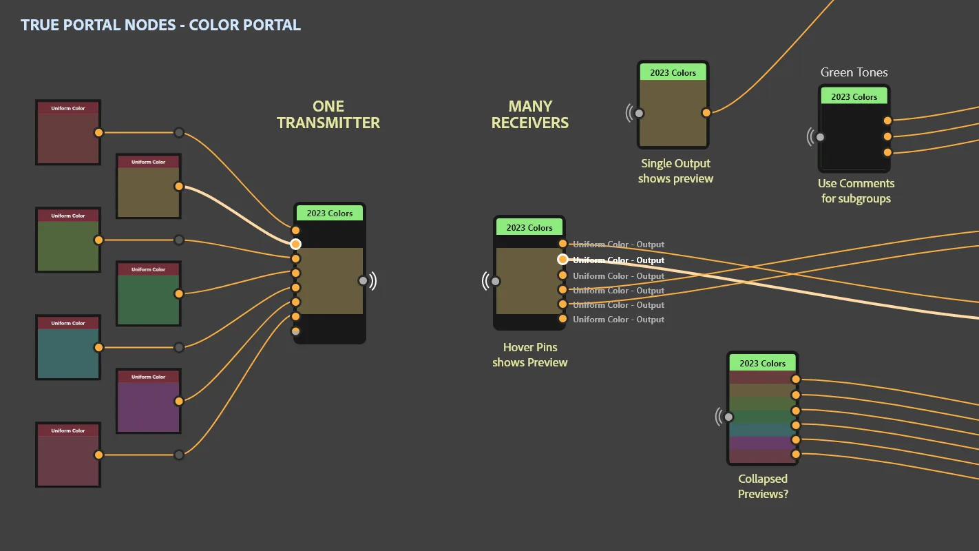
Color Portal
Showing how we could pack colors into a multi-Portal node and use it as a color library elsewhere in a graph.